Saturday, February 19, 2011

Healthy Appetite for Design


My first try at recreating layout with InDesign. Once I figured out how to line everything up with margins and columns, and learned the difference between serif and sans serif, the rest was pretty easy, though time consuming. I learned a lot about how to use InDesign through this project, because I had to put all previous knowledge about colors and composition together, pay attention to picas and fonts, etc.

Earthy


I had the ocean and the forest in mind when creating this cooler version of my design, which again emphasizes the organic nature of the design - just as in my black & white project, I wanted to create an image reminiscent of nature.

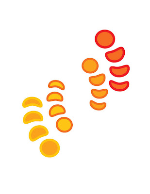
Feelin' Hot Hot Hot


Using the same layout as my Black & White project, I wanted to make these natural shapes come alive with heat - I did this by not using any black or cyan when choosing the colors, instead I used red and yellow to create this warm feel. I feel like this radiates orange light, reminiscent of a very hot summers day.

Simplicity is Key


I was looking for something simple with this inDesign project. I wanted shapes that felt organic, that you might see in nature, but I wanted there to be a repetition in those shapes and to feel movement through them. That is how I decided to do a sort of central spiral, and the feel of the circles growing or shrinking into the spiral, like the shell of a Nautilus, but reminiscent of eggs.