Tuesday, May 10, 2011

The Layout Experience

Here is an example of magazine layout from earlier in the semester. We took the article, which was a restaurant review for Frida in Andersonville, created a layout to fit the tone, content of the copy.

I learned more about InDesign when doing this. Now I know that I should have used the style sheets, but the one thing I do like is the overall feel. It feels balanced, although if I had to go back I would make the line between the text smaller and closer to the headline, and probably work the address into the text, as opposed to at the bottom of the page.

Bis Abuela, Donde esta?!


I wasn't able to post my restored photo to my blog before our class folder was deleted, and unfortunately I misplaced my usb drive (nowhere to be found!). I didn't want it to seem like I forgot abou this assignment - it was great experience with Photoshop, and photo-doctoring is a very important skill to know in any kind of design and layout. Just wish I could post my final product.


Sound Expertise


This is my final project for this semester. I interviewed a very interesting man, Pantelis Vassilakis, who teaches here at Columbia. Vassilakis made for easy story-writing, because his life is so fascinating - he grew up in Athen's Greece, played volleyball for the Greek national team, was a successful model who traveled throughout Europe, an accomplished composer, musician, and sound engineer. Now he teachers sound at Columbia, focusing on cognition and perception.

The interview went really well which made for some great quotes. I kept close watch on Vassilakis' movement: his hands were constantly gesturing, his eyes widening, his large, friendly smile popping up every few seconds. He also carried himself with poise, and purpose. He is clearly a driven man and an intelligent man, but also very creatively inclined.

We discussed philosophy, religion, family, capitalism. For an hour Vassilakis was candid with me, telling me all about his life and his beliefs, and I enjoyed it.

For the layout, I knew the picture of him and his family had to be front-and-center, and large, because it was such a strong photo, showing how happy he is.

Elio suggested the headline, which I like because I wanted a headline which reflected his love for sound, since it seems to be his strongest passion. Another working headline was: Renaissance Man, which is kind of boring.

The quotes I pulled were those that stuck out the most, and would appeal to a Chicago reader, flipping through the magazine.

I especially love the picture of Vassilakis as a boy, and how it contrasts to him as an adult with silver hair and a wife and children. He is still very proud of his country.

Tuesday, March 15, 2011

I like the Nightlife.


Here is my Midterm website project. I actually really like how it turned out. For my theme of late-night dining I wanted to keep the colors simple - I decided to simply do black and white, which would contrast well with each other, and seem like neon lights in the dark. The white text really pops on the black background. I chose American Typewriter for the site's logo and link buttons, because I felt it's old-fashioned feel strengthened the theme of diners and Americana. The photos also have white frames, and simple colors so the page doesn't look to busy. I particularly like the angles between my main photo and the one in on the top right; the two neon signs interact well with each other, creating a kind of tipi. I used outside shadow on the button's text and inside shadow on the buttons background to make them pop out - this way they match the icons I added for Facebook, Twitter, and the RSS feed.

Thursday, March 3, 2011

The Coen-fographic


Here is my infographic on leading actors who have appeared in multiple Coen Brothers movies. I chose 5 actors, because of space, and listed their characters and films, as well as the awards they have received, where applicable. I found this assignment more difficult then the others, because of how much goes into making an information graphic be able to contain information and be asthetically pleasing. I played around with colors and fonts a lot, and tried to find a good way to keep the text symmetrical, but balancing five different images with text was difficult.

Saturday, February 19, 2011

Healthy Appetite for Design


My first try at recreating layout with InDesign. Once I figured out how to line everything up with margins and columns, and learned the difference between serif and sans serif, the rest was pretty easy, though time consuming. I learned a lot about how to use InDesign through this project, because I had to put all previous knowledge about colors and composition together, pay attention to picas and fonts, etc.

Earthy


I had the ocean and the forest in mind when creating this cooler version of my design, which again emphasizes the organic nature of the design - just as in my black & white project, I wanted to create an image reminiscent of nature.

Feelin' Hot Hot Hot


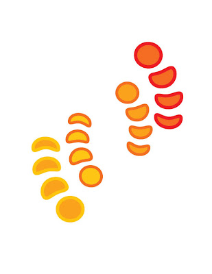
Using the same layout as my Black & White project, I wanted to make these natural shapes come alive with heat - I did this by not using any black or cyan when choosing the colors, instead I used red and yellow to create this warm feel. I feel like this radiates orange light, reminiscent of a very hot summers day.

Simplicity is Key


I was looking for something simple with this inDesign project. I wanted shapes that felt organic, that you might see in nature, but I wanted there to be a repetition in those shapes and to feel movement through them. That is how I decided to do a sort of central spiral, and the feel of the circles growing or shrinking into the spiral, like the shell of a Nautilus, but reminiscent of eggs.